
MoneySpyder have conducted some research on the state of
mobile ecommerce among the biggest sites in the UK.
We looked at the top twenty visited ecommerce sites
in the UK and found the common patterns as well as the stand out pieces of
functionality that we think will be standard practice within the next 12
months.
Why Best Practice?
You may not be in the top 20 sites in the UK but that doesn’t
mean that you can ignore what these sites are doing. These ecommerce sites
account for such a high proportion of shopping clicks that users are
effectively being trained to shop online by using sites that are bigger than
yours.
The surprising thing about reviewing best practices is the
level of uniformity among the top players in ecommerce. Everything down to menu
and subcategory order is becoming standardised. By not following these rules
you are making it just that little bit harder for users to browse through your
products.
So, here we go:
The Basics
How many sites are
mobile optimised?
15/20 sites we reviewed were mobile optimised. River Island
have a prominent link to their app which is effectively a best practice
m-commerce shop, which helps to mitigate their shortcomings. Another surprise
absence from the mobile scene is Apple, the inventors of the smartphone.
Is responsive design
the best solution for mobile?
Only Currys have a responsive website. 11/20 of the
remaining sites have ‘m.’ URLs.
Google have come down firmly on the side of site design – as
have MoneySpyder – as it reduces workload and improves mobile SEO. Responsive
designs mean that instead of redirecting users to new ‘mobile’ version of their
pages, templates simply recognise the browser resolution and change the way
designs are presented. This means you only have to keep one website up to date.
Responsive design is a more complex design solution but it is
ultimately better for users and business owners. We’re confident that it will become
industry standard in the near future. We’ve recently spoken to a number of
clients who are moving from ‘m.’ solutions to responsive design.
Mobile Home Page
Are Apps being advertised?
8/20 sites offer links to an app or other mobile specific
experiences. This is a great idea. Once you have your app downloaded onto a
user’s phone, you become a part of their phone browsing furniture; a big win
for user engagement.
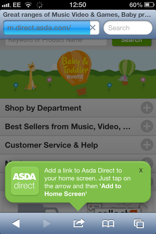
An option that’s becoming popular is reminding users that
they can add a link to their site directly to their home screen. This is great
for companies without an app.
Is store finder
prominent on the home page?
9/15 have prominent links to store finders. Optimise your
store finder for mobile use.
Many mobile visitors are using mobile to locate shops and
opening times. It’s good practice to put a store finder and link to opening
times in the header. It’s also a good idea to put your postcode in the header
if you only have one location. Many large hotels do this to make it easier for
lost tourists to find them.
Is the navigation in
the form of ‘stacked categories’?
12/20 sites have the ‘classic’ mobile browsing look with
categories stacked on top of each other. This is the basic building block of
mobile websites. Easy navigation is the key.


Is the mobile home
page optimised with featured products and images
Many of the sites use the area above the navigation to
advertise one or more deals or reinforce their brand with scrolling banners.
Currys has a big search bar followed by a long page of deals and offers. This
is a good approach that gives the user interesting content from page one.
Is email newsletter
sign up prominently featured?
3/20 have email signup on the home page.
Only Asos has email signup near the top of their home page (it's just below the fold).
This capitalises on the differing ways users interact with mobile sites and
desktop sites. It is much easier for a mobile browser to sign up for an email
than it is for them to go through the whole checkout on their phones.
Topshop and New Look get partial credit for having email
signup at the bottom of the page.


Search
Functionality
Is search the main
feature of the home page?
14/20 have their search bar front and centre. Good search
functionality allows users to reach the product they’re looking for with the
minimum of fuss. The aim should be to funnel as many users through your search
as possible, give them lots of results, and then provide them with good
filtering options.
How good are the filter
options for mobile search?
9/20 offer some kind of filter option from their search
results page. Most of these offer a pared down faceted navigation similar to
those found on normal category pages. Users have to select filters from drop
down menus. When this is done badly, however, it can be unintuitive and
frustrating. Very and Tesco both have good examples of search filtering.


Do users have the ability
to select different category views?
New Look and Marks & Spencer allow users to change the
way they view products. Users can switch between stacked and gridded products.
This is great functionality that shows companies adapting to the specific
behaviour of mobile users.
Product Pages
Are images mobile optimised?
5/20 offer mobile specific image scrolling. It’s a great
idea to allow users to scroll through images by swiping the screen. Especially
as the pop-ups or image zooms of many sites are hard to use in mobile screen
resolutions. Topshop and Very have good product pages.


Checkout
We devoted a whole post to best practice mobile checkouts a
week or so ago. You can find it here.
If you would like any help creating or optimising your mobile site you can email us at info@moneyspyder.co.uk or see our ecommerce platform page or ecommerce consulting pages
If you would like any help creating or optimising your mobile site you can email us at info@moneyspyder.co.uk or see our ecommerce platform page or ecommerce consulting pages
No comments:
Post a Comment